Image mode layout
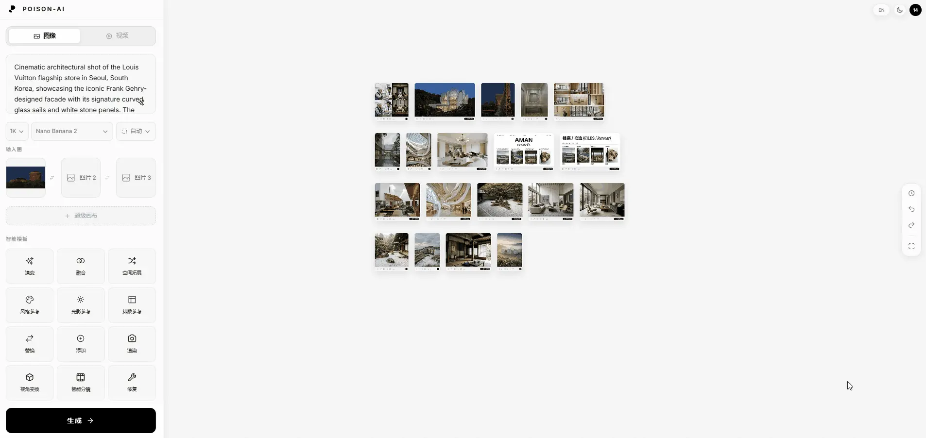
In image mode, the main interface is made up of the left parameter panel and the right canvas; the top bar sits above both.
Layout (left–right)
- Left: Fixed-width parameter and input area — Logo, mode switch, prompt, parameter dropdowns, reference images, Smart Templates, and the Generate button.
- Center & right: The infinite canvas for placing and working with results; the right edge of the canvas has the vertical toolbar (History, Undo, Redo, Fit to screen).
- Top bar: At the very top of the page, with language, theme, and user avatar on the right. See Global nav & right toolbar.
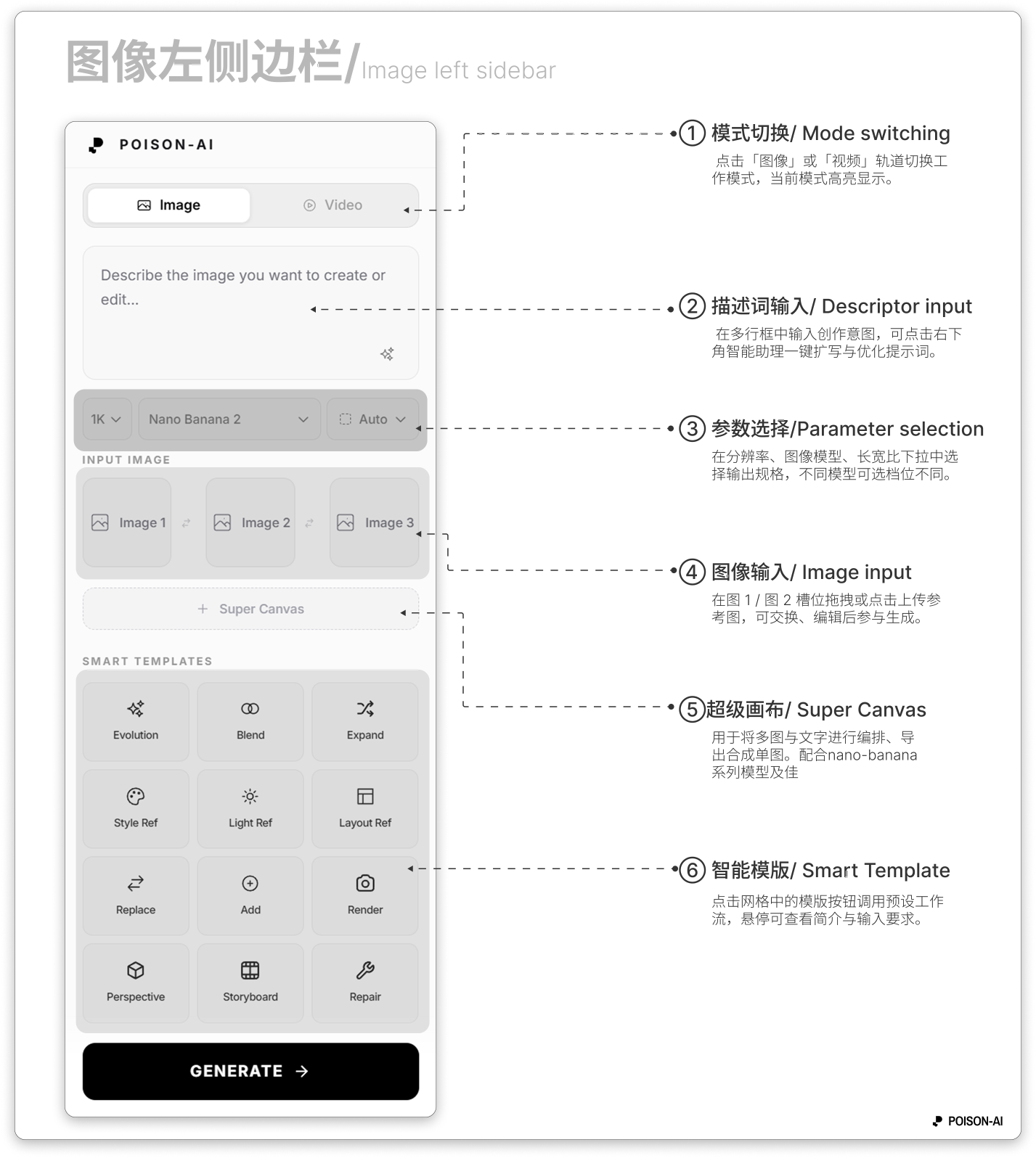
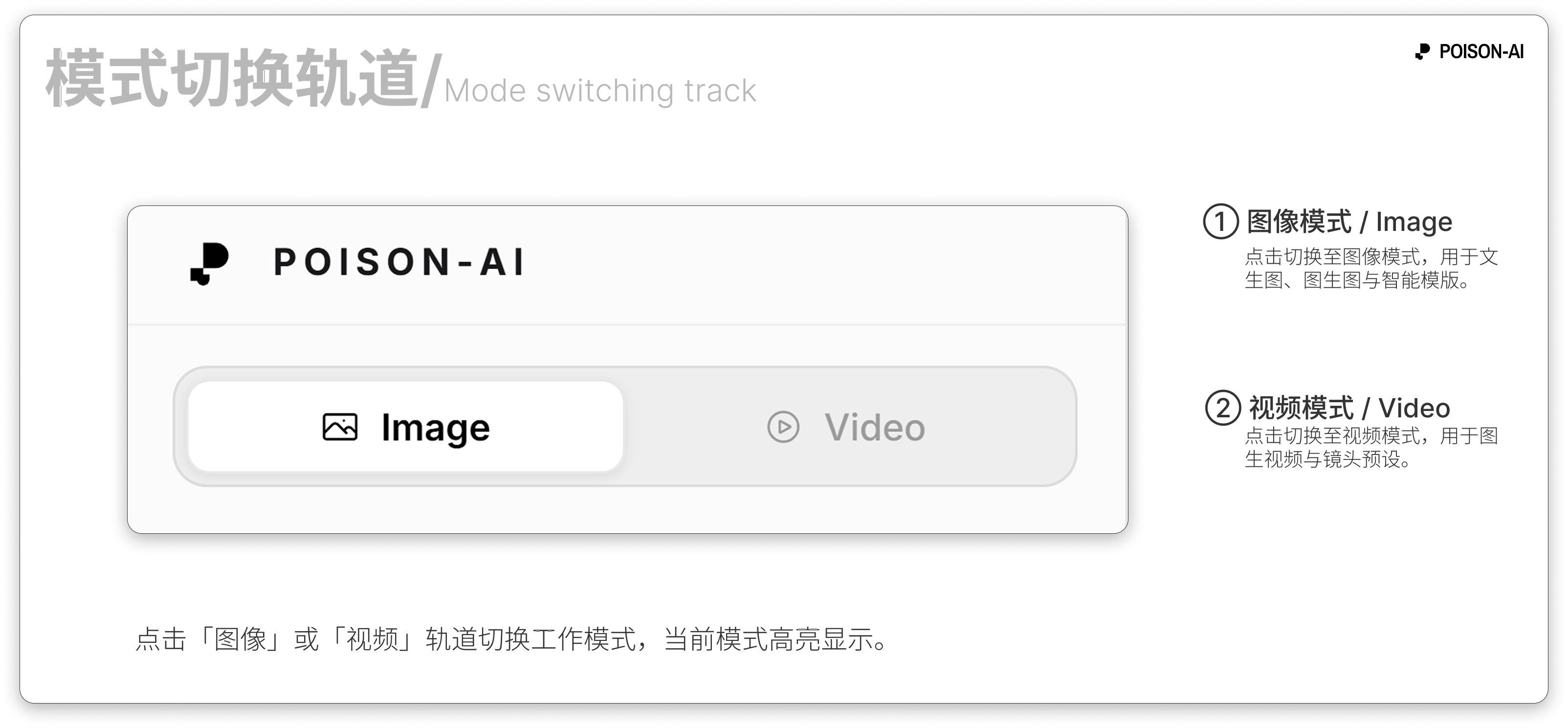
- ① Mode switch — Click the Image or Video tab to change workspace mode; the active mode is highlighted.
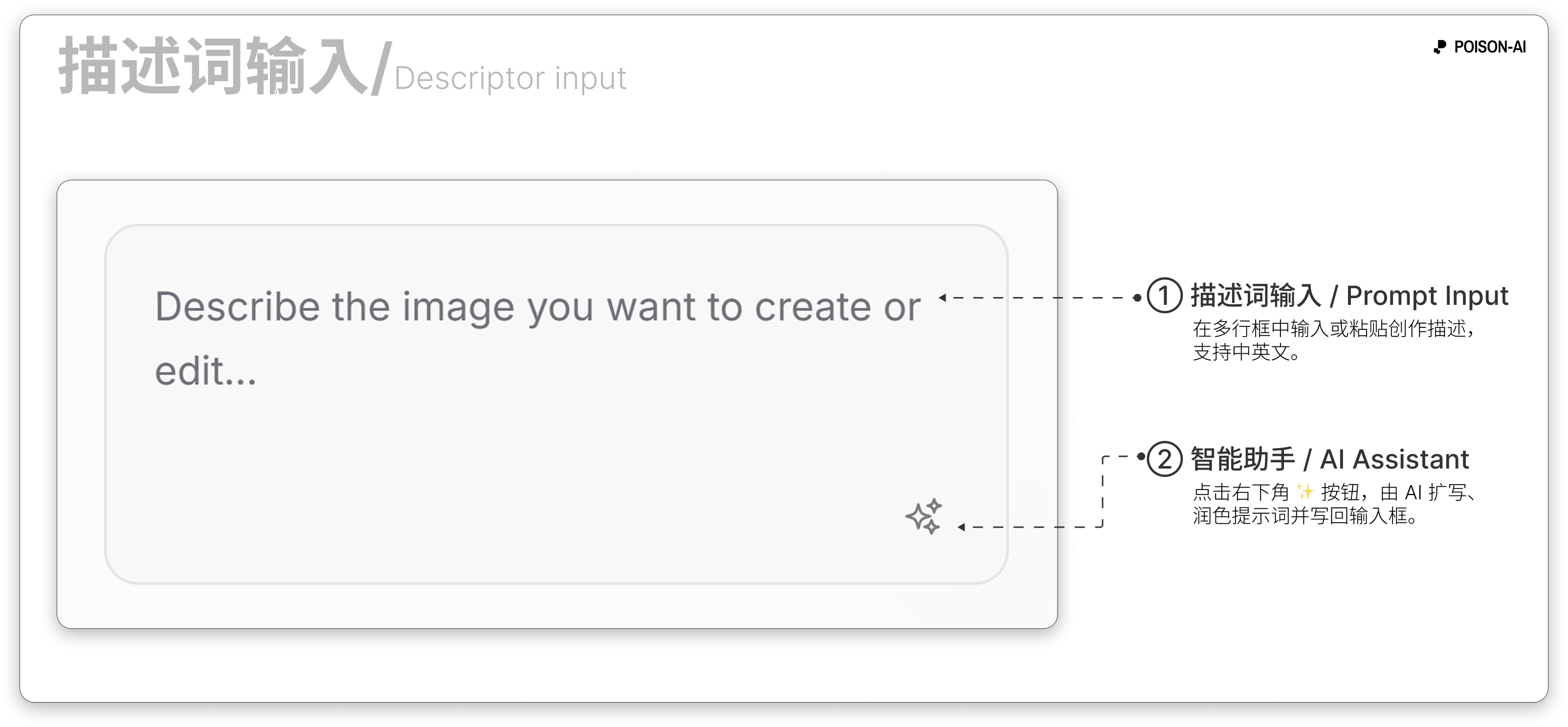
- ② Prompt input — Enter your idea in the multi-line box; use the Smart Assistant (bottom-right) to expand and optimize the prompt.
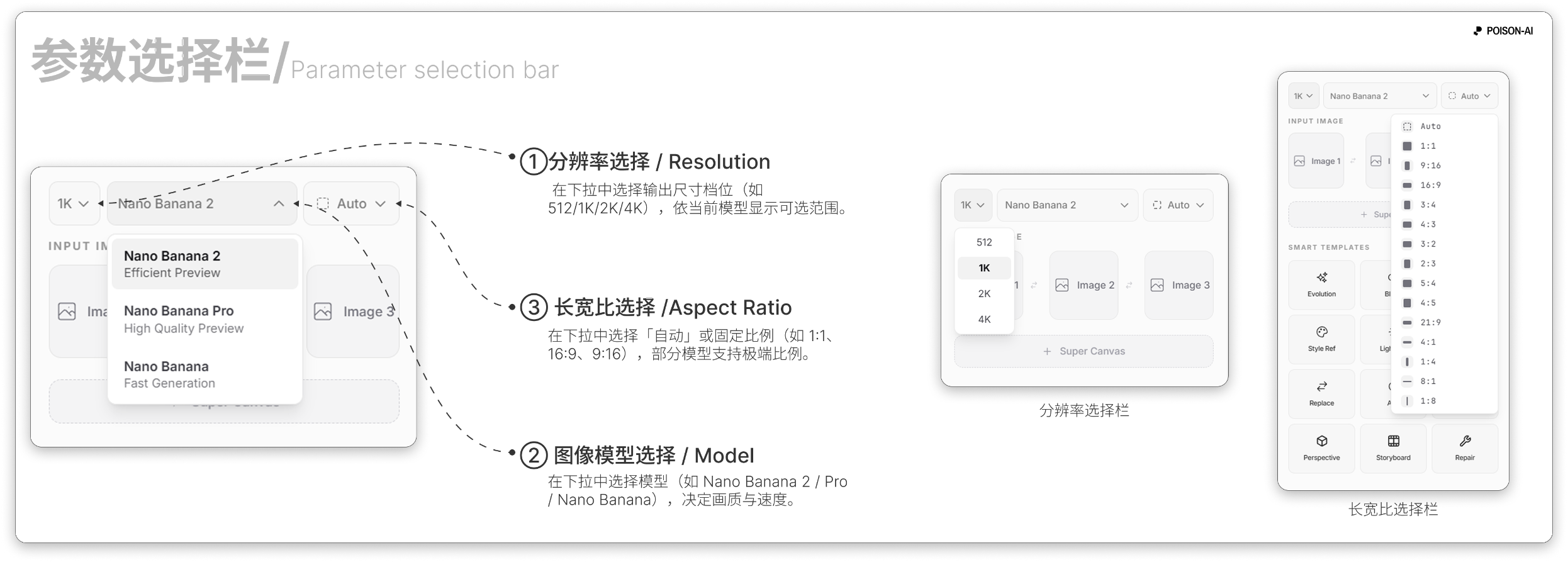
- ③ Parameters — Choose output specs in the resolution, image model, and aspect ratio dropdowns; options depend on the selected model.
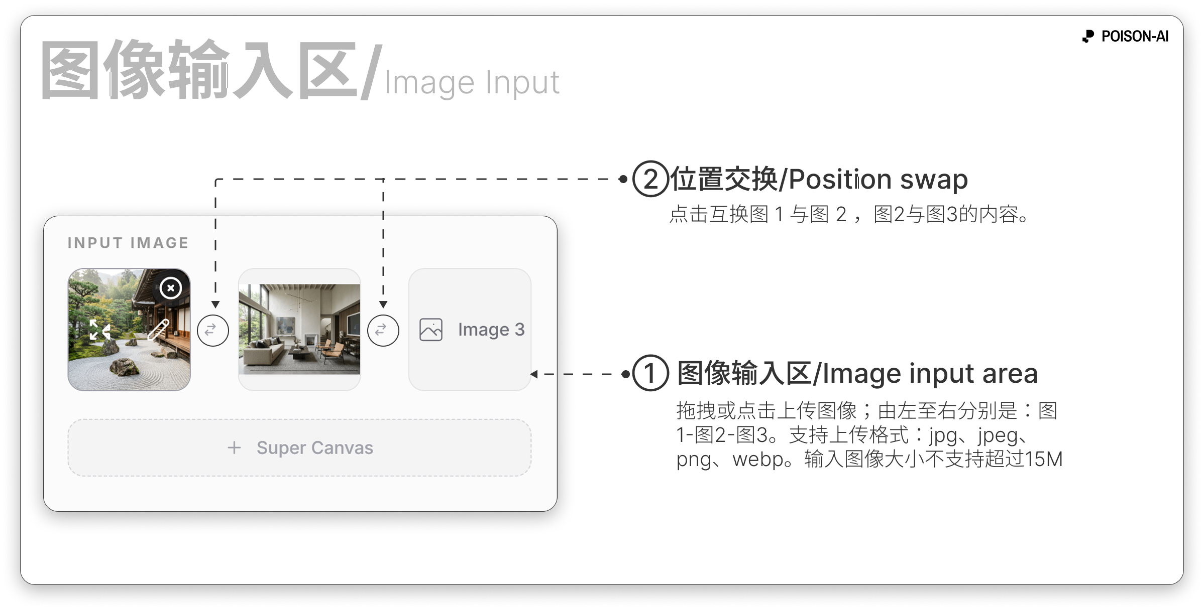
- ④ Image input — Upload reference images in Image 1 / Image 2 slots (drag or click); you can swap or edit them before generating.
- ⑤ Super canvas — Entry below the reference image area for multi-image and text layout and export.
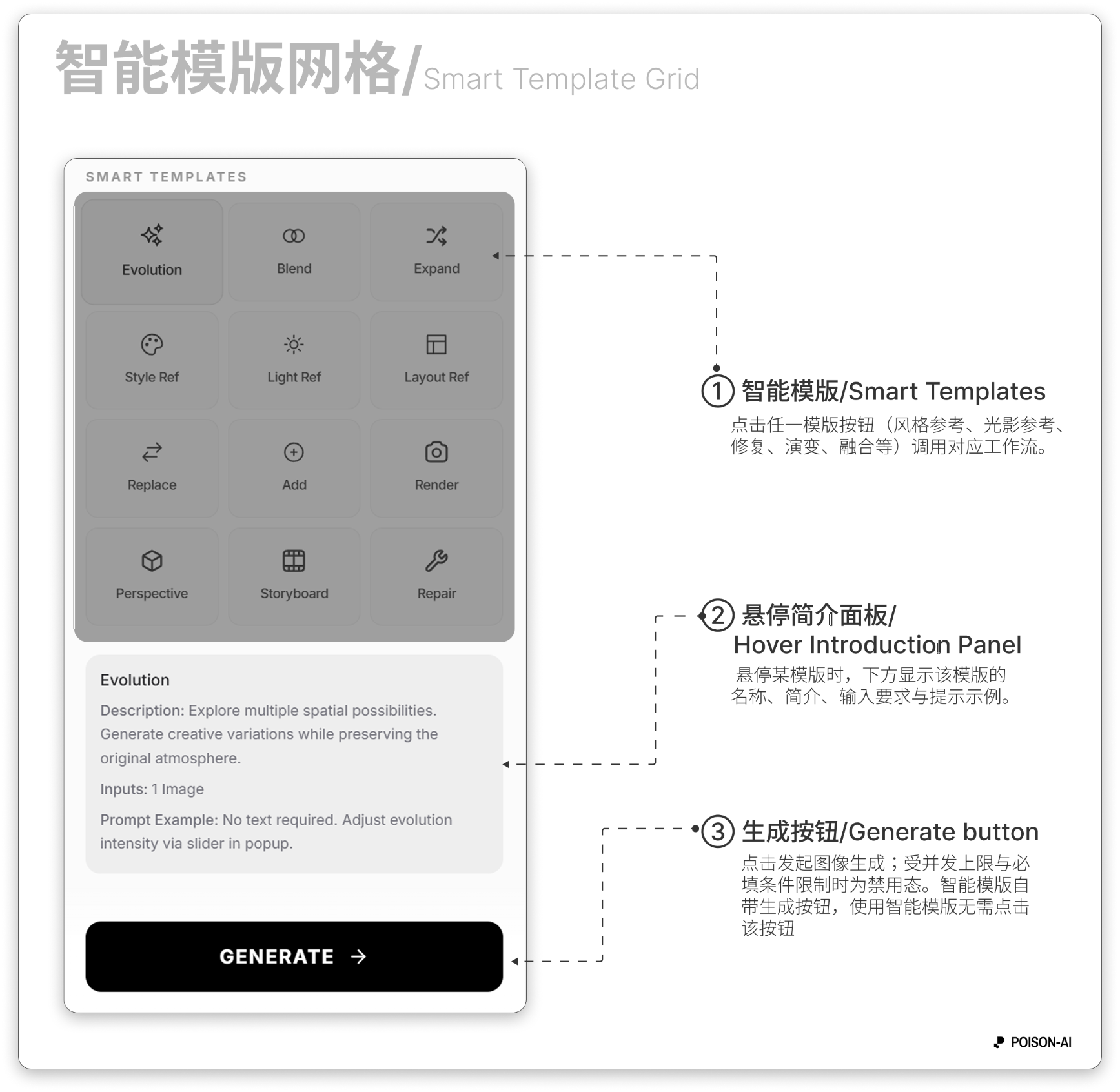
- ⑥ Smart Templates — Click a template in the grid to run a preset workflow; hover to see a short description and input requirements.
Left panel (top to bottom)
Header
- Poison Logo (full name, hover effect); no other buttons.
Mode switch
- Two options: Image | Video, with icons; Image is highlighted in image mode.
- Prompt input
- Multi-line text box; placeholder: "Describe the image you want to create or edit...".
- Bottom-right: Smart Assistant button (✨) to expand/optimize the prompt; shows Loading while processing.
- Parameter row (image mode only)
- Resolution: Options depend on the current image model (e.g. 1K / 2K / 4K).
- Image model: e.g. base, HD, flagship tiers.
- Aspect ratio: Auto or fixed (e.g. 1:1, 16:9, 9:16); some models support extreme ratios.
- Reference images
- Section titled "Reference images" (or equivalent).
- Image 1 and Image 2 upload slots; drag or click to upload, swap the two, or click Edit on a slot to open the image editor.
- Max file size and formats follow in-app rules (typically up to 15MB per image).
Smart Templates
- Title "Smart Templates".
- Grid of template buttons (Style Reference, Light Reference, Repair, Evolution, Blend, Expand, Render, Perspective, Storyboard, Layout Reference, Replace, Add, etc.); click to open a settings modal or run directly.
- A hover panel below shows the hovered template’s name, description, and input requirements.
Generate button
- Fixed at the bottom: main Generate button (with arrow icon); click to start image generation. Disabled when concurrency or required fields are not met.
Center & right: canvas
- Canvas: Infinite; zoom with the scroll wheel, pan by dragging on empty space, multi-select and arrange result cards.
- Result cards: Each result appears as a card with an action bar (Compare, Enhance, Generate video, Use all, Use output, Rerun, Download, Close, etc.). See the canvas and cards docs for details.
- Right toolbar: History, Undo, Redo, Fit to screen. See Global nav & right toolbar.
Summary
| Area | Contents |
|---|---|
| Left | Logo → Image/Video switch → Prompt + Smart Assistant → Resolution / model / aspect ratio → Image 1/2 reference slots → Smart Templates → Generate button |
| Center/right | Infinite canvas + result cards; right edge: History / Undo / Redo / Fit to screen |
If the product adds or removes sections, follow the in-app UI.